Curtain and Wall Color Coordination Guide
Curtains and wall colors have a close relationship that can greatly impact your decor. Whether you have vibrant hot pink walls or bland off-white rental walls, the right curtain choices can enhance or transform the space. Learn how to match, mix, and coordinate tones, neutrals, and lighting effects for a cohesive look.
By Quinn Cooper
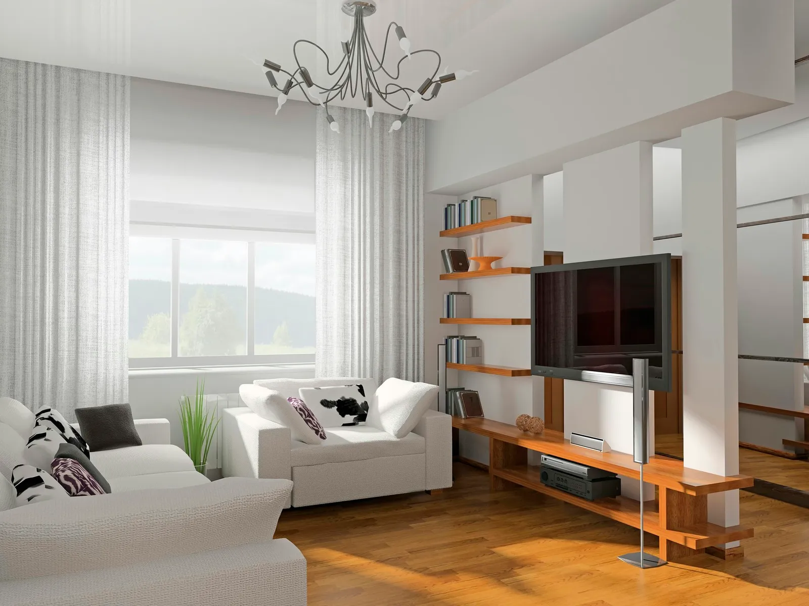
White drapery and white walls.
The relationship between curtains and wall colors is deeply intertwined, and getting it right can elevate or ruin your interior design. Think about hot pink walls paired with pink-and-green taffeta tattersall drapes—it evokes the final days of the Raj, and that intense visual heat might feel as bold as chili peppers to some. Meanwhile, in a rental with off-white walls that are as plain as unbuttered toast, the only change you can make is the window curtains. And what about a nursery with purple walls? Would you dare to hang orange and white striped curtains, risking overstimulation for the baby? Clearly, curtains and wall colors share a mutual dependence that can define your decor.
Match and Mix
To make a small room feel larger, match your curtains to the wall color, but incorporate a block or stripe of contrasting color to prevent monotony. For instance, walls the color of toast with white trim and matching taffeta drapes could be utterly boring—unless you add a wide band of mallard taffeta across the bottom half of the drapes. That burst of color then allows you to introduce a mallard velvet sofa or an abstract rug in mallard and toast. A couple of daffodil silk throw pillows can shift the room from subtle to striking. In a shared room with peach walls, curtains become lively enough for tweens when bisected with a purple color block. This opens the door to purple shag bedside rugs, a purple dresser, and patchwork quilt bedding that includes blocks of peaches and plums.
Tone-on-Tone
Since curtains constantly interact with walls—brushing, leaning, floating, drifting, and resting against them—the juxtaposition is inevitable. To achieve a seamless gradation between fabric and paint, choose a curtain tone that matches the wall but is a few shades darker. Heavy cream walls, with their subtle yellow undertone, provide a rich backdrop for maize curtains. Palest pepper-green walls pair well with fern or moss watered silk. You can also coordinate walls and drapes by pulling colors from the carpet. A cerulean, ivory, and cinnabar Oriental rug can tie together pale blue walls and cinnabar-sapphire-and-ivory patterned curtains.
Neat Neutrals
In a sunny room, neutral-colored curtains tend to wear better than vivid ones because fading is less noticeable, and the lack of a dominant color either highlights bright walls or blends with champagne wallpaper or wheat-colored matte paint. Consider oyster-white lined faux silk curtains against slightly glossy oyster trim and flat oyster-white walls for a clean, elegant look. In a formal room, letting the curtains pool on the floor adds drama. For a pure white-walled room, drift snowy sheers across the windows and control light with inset white shades that roll up out of sight during the day. Pewter velvet drapes in a dove-gray room strike a balance between theatrical and understated. Add a purple velvet sofa and chartreuse brocade chairs for royal decadence, or stick with a gray linen sofa and charcoal and vanilla striped brocade chairs for a more restrained feel.
Bounce Lighting
A room that receives a lot of light will change color depending on the curtains. When sunlight passes through unlined fabric, a bright color can tint the lighter walls of the room. A similar effect happens when light bounces off shiny, vivid curtain colors and reflects onto the walls. In a dining room with vanilla, apricot blush, or white walls, ceiling-to-floor scarlet and gold striped taffeta drapes reflect a warm glow and enhance the warmth of polished wood furniture. Light filtering through rose-colored curtains gives pale walls a healthy, pinkish tint. Sunlight through blue drapes might make a pale blue, white, or cloud-gray room feel mysterious—or depressing. Whenever possible, test curtain fabric under all lighting conditions in the room before finalizing your fabric and wall color choices.